Essential iOS Game Design Tips Pt. 1
It’s been a little over a year since I’ve posted anything iOS or game design related — in fact, my last post was quite different. That said, I’m still quite involved in the mobile game industry even though I am currently living in Colombia. Actually, my FOMO is at an all time high as I think about missing the spring/summer madness which are the game conferences (GDC, PAX East and E3). In honor of the kick of of what I call “Game Conference season” (March- September), I decided to go back to the basics and post some quick, essential iOS Game Design tips that I think will be helpful for some of the newbies out there — and maybe serve as a refresher for some of you vets!
Principles:
First things first, we’ll start with some design principles for iOS. You can think of these as the foundations upon which everything you do in your game should be built. If you can follow these game design principles, you can create an amazing experience for your users.
Clarity
Clarity is exactly what it sounds like — be clear! haha. The problem is, as game developers we become so entrenched in our own design, that we forget to take a step back and evaluate whether navigation, animation, alerts, directions, etc are really clear! Many times, you design something that makes sense in your mind, but to someone new to your experience, these same things can seem ambiguous, confusing and unclear. This causes friction and can result in them exiting and maybe even deleting your app. Always do passes through your game to ensure every thing is clear — from legible text, to precise, representative icons.
Consistency
Life is about consistency… and so is game design! Inconsistent game design can really take an otherwise great game and make it confusing, disorienting and just a pain to use. This applies to not only button and icon design, but animations, fonts, colors, etc as well. For example, you want to ensure that all of your buttons have a consistent look so that users can immediately identify interactive elements in every section of your app. Also, staying with a consistent font makes the game look cleaner, and more well put together.
User control
User control is a big one. No one wants to feel like they don’t have control of their experience. Allow users to pause, restart, go back, quit, and navigate freely through your game without trapping them into making a decision that they might not want to make. This is especially important for destructive actions like “delete” or “restart” or “quit.” You should ALWAYS ask a user if they are sure that they want to take these actions in case they fat fingered it.
Feedback
Another really critical issue that I see all the time with games is them not giving the appropriate user feedback. Anytime a user takes an action — confirms, declines, loses a life, wins a level, etc, there should be some form of user feedback. Ideally, you’d use a combination of feedback elements. Don’t just think sound or animation — think both! This will really give you an opportunity to reinforce what has happened on the screen and avoid any types of potential confusion.
User Interface:
User Interface or “UI.” Probably the most overused terms in game design (and really technology in general). There are many elements that make up user interface design but in this article I want to focus on 3 that I think can really make a huge difference in your general game design.
Typography
Typography is like a science. Like literally. For me, it’s one of the most interesting aspects of User Interface design. The way you utilize, weight, height and color can really affect the usability of an app. When it comes to typography, above all it is really important to make sure your fonts are legible at all sizes and all places within your game. You also want to make sure your font matches the look, feel and style of your game. Don’t use generic typeface in an experience like a platfomer (my FAVORITE GENRE 🤓) which brings users into a fully immersive world. You also want to make sure you are using your typeface to emphasize information. Do this by using weight, size and color to emphasize or deemphasize information or hierarchy. Lastly, an ode back to one of our design principles — be consistent with your typeface. If titles, buttons, instructions, etc have certain weight and color, make sure that is consistent through your experience so users can immediately identify these elements.
Navigation
For me, navigation is the most important element of a game’s user interface. This can really make or break your experience. So first, let’s make sure we all have a foundation on navigation. There are three main navigate types:
Hierarchal Navigation: User makes one choice per screen until you reach a destination. To go to another destination, you must retrace your steps or start over from the beginning and make different choices. Settings and Mail use this navigation style.
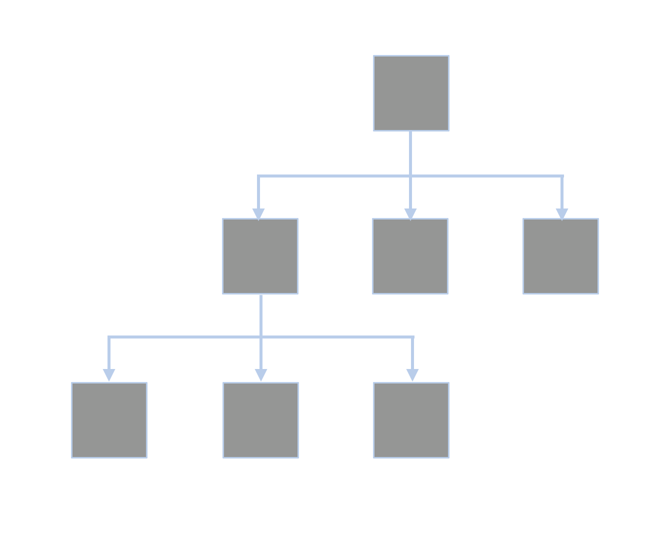
With Hierarchal Navigation you very much need to move in a linear fashion. You can see examples of this with the Mail and Settings apps on iOS.
Flat Navigation: User switches between multiple content categories. The “Music” and “App Store” apps use this navigation style.
With Flat Navigation you jump to different “tabs” of content types then explore these content types. Examples of this is the Facebook app.
Content/Experience Driven: Move freely through content, or the content itself defines the navigation. Games, and other immersive apps generally use this navigation style.

With Content/Experience Driven navigation users can move freely within the app to navigate where they will like to go. This is common in games.
Now that that’s out of the way, here are a couple of tips in regards to navigation. The first is to always provide a clear path. People should always know where they are in your app, and how to get to their next destination regardless of your navigation style. Secondly, your structure should make it easy to get to the content of your game. Make it REALLY easy for users to get to the important information or actions in the least amount of steps as possible. Finally, use standard navigation components! Share buttons should look like share buttons. Back buttons should look like back buttons. Setting buttons should look like settings buttons! These are things that people are accustomed to and familiar with. Don’t get too cute and remix these too much (haha). It won’t be looked at as innovative or helpful. It will be looked at as confusing.
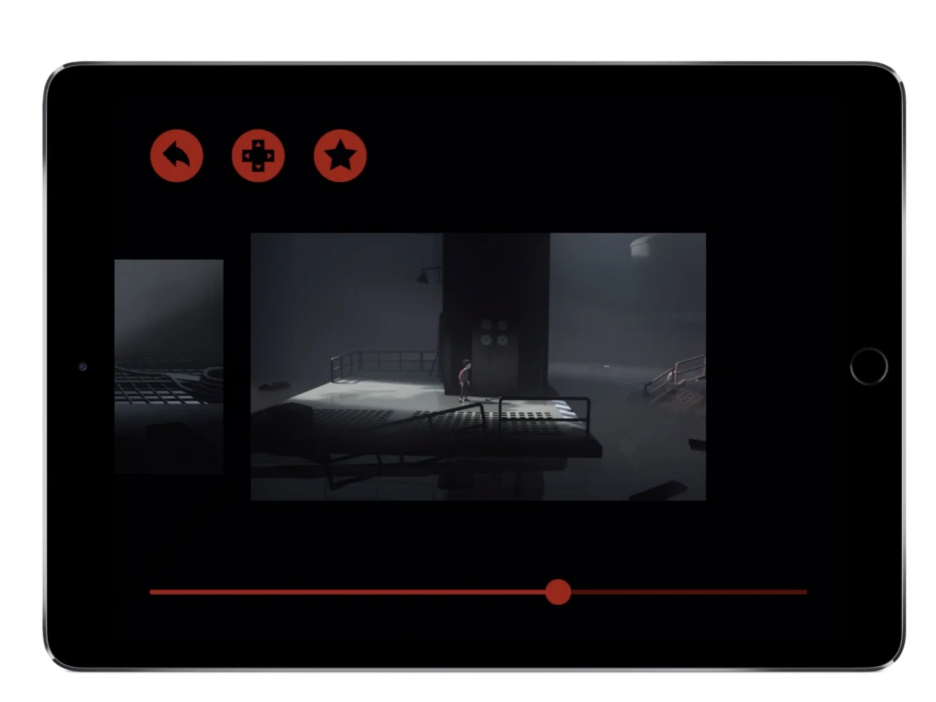
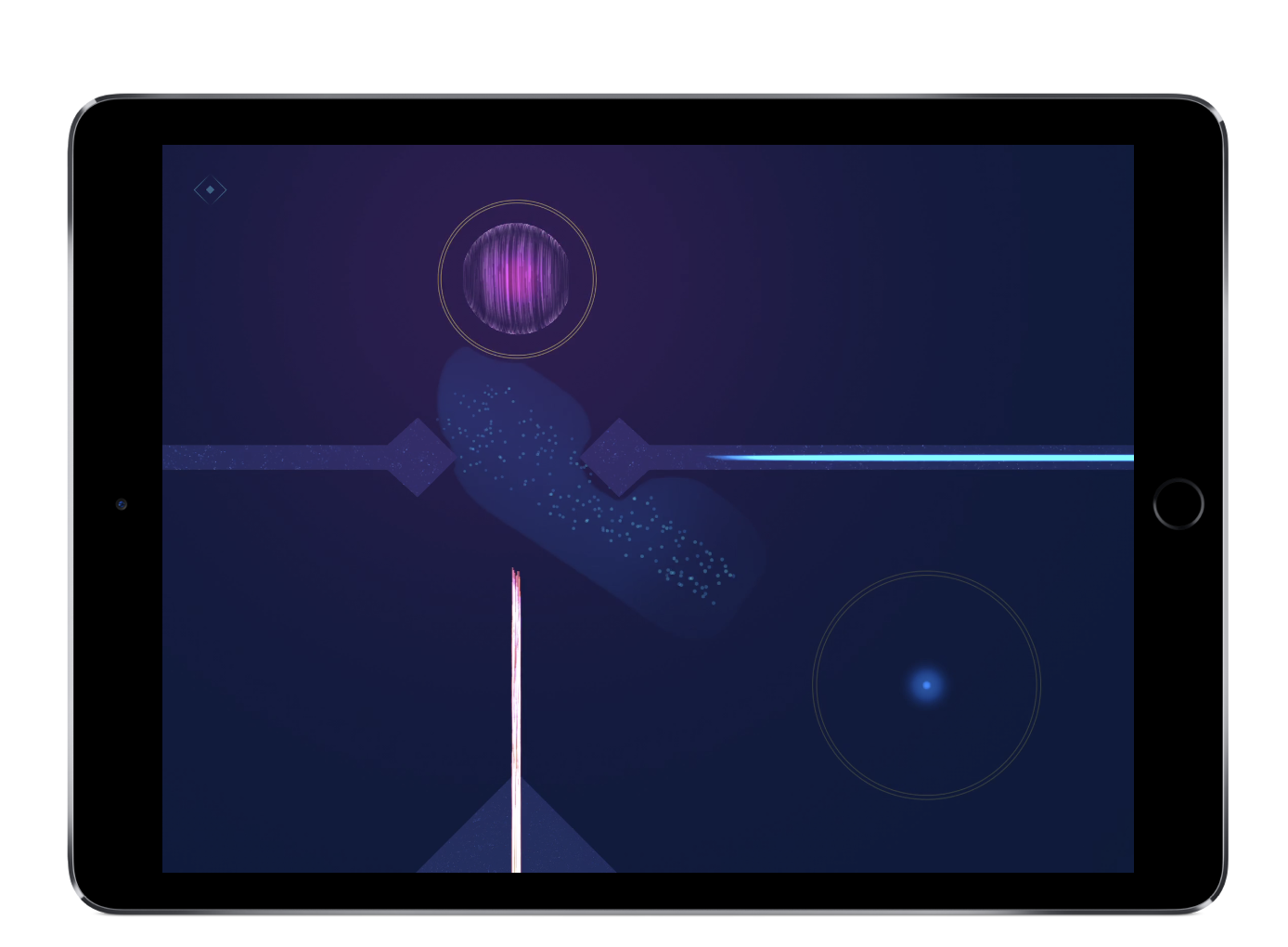
Inside by Playdead does a great job of keeping navigation simple, clear and consistent.
UI Elements
One of the most important aspects of creating great UI is making sure your UI elements are consistent — specifically the layout. Make sure buttons like settings, menu, back, play, etc all have consistent locations on every game screen. Inconsistencies disrupt the users’ game experience because the user has to think about where they are and where they came from instead of JUST PLAYING. Clear button states are also an integral part of designing UI elements. Its important that developers make it clear to players which objects are tappable and which aren’t. If users have to think too much about what to tap, they will again be taken out of the feeling of JUST ENJOYING your game. Always use 3 visual states for buttons and controls: normal state (shows elements are tappable), pressed state (shows things have already been tapped) and disabled state (shows things are not currently active). Finally, make sure all your UI elements are the minimum tap size of 44x44 its. Do not make buttons any smaller than this as they will become too difficult for users to tap. No one likes missing, and missing, and missing a button because it is too small.
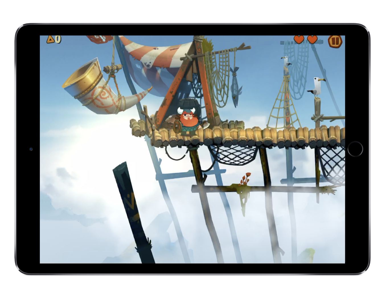
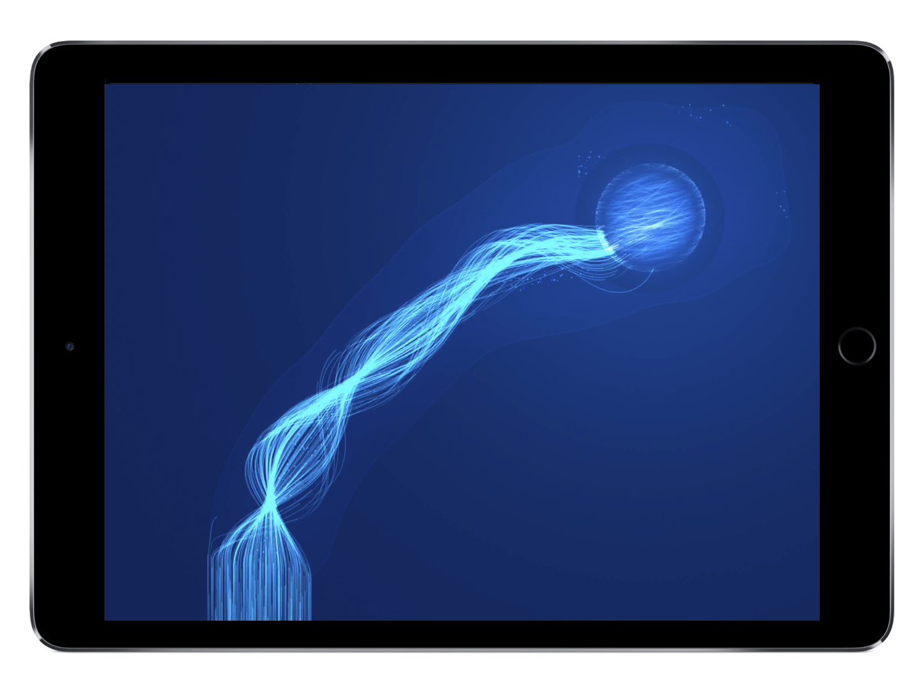
Oddmar by Mobge LTD does a great job in keeping UI Elements consistent through the game experiences.
User Experience:
When I think about the phrase “user experience,” much like “User Interface” it seems like a word that is overused and misunderstood. I mean, you can define it pretty easily: “the overall experience of a person using a product” — and everyone goal is to have a GREAT “User Experience” in their products. But what does that ACTUALLY mean!? For me its quite simple — the experience, look and feel.
The Experience
Your user’s user experience with your game begins the second they launch your app (some argue, before when they hit your App Store page — but I digress 🤪). So, when you think about your experience, you should be thinking about it holistically. For example, make loading screens, visuals, audio, and animations engaging and delightful for your users. This helps draw them into YOUR world. Also, don’t make loading screens a drag on your experience (a huge pet peeve of mine! 😑). Instead, make them snappy by pulling down as much data in the initial app download as possible as to not hit users with unnecessarily long load times at the outset of the game experience. This will allow users to get into your game quickly and actually start to enjoying the core experience right away! Think about every detail of your EXPERIENCE from the load screens to visuals, to audio and animations. Nailing these little details ensure your game is enjoyable — and, thats the point, right?!?
Look and Feel
Have you ever played a game that hooked you? 🙋🏾♂️ There is something about it that you just cannot pinpoint— and it’s EVEN HARDER to describe. Every successful game has its own unique look and feel that endures the game with the audience. It can be a combination of the characters, the audio, the animations, the color scheme, the buttons, the music, the unique story, world and gameplay. You should be looking at ALL of these elements as key ingredients to creating an amazing experience. For lack of a more scientific term to describe this, I’ve coined the term “look and feel” (haha, jk). The thing that makes your game, YOUR GAME.
Your game should always have a cohesive look and feel. All the visual elements should be consistent with the theme of your game. Again, consistency is a major iOS design principle that helps people feel at home in your game. Inconsistencies can be jarring and confusing. You want to make sure you continually review your app’s design to ensure every page, screen, level, has consistent look and feel. Your sound should also be a huge part of pulling users into the world of your game. Great sound design works to captivate a user — from the background music, to flourishes on your character, to simple things like the audio when tapping buttons — it is critical to have engaging, immersive sound design. Animation also really help get across the look and feel you are trying to impart on your users. From character animations, to button animation, they should feel at home with your game.
Okay, thats for chapter one! Again, this is meant to be a bit of a primer for beginners and/or refresher for vets to keep them honest and focus on the foundations of building great games. Hope this was helpful — and look out for Part 2 soon!